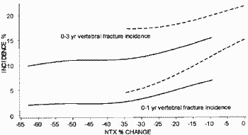
This is the key graph from Richard Eastell et al. (2003) J. Bone. Miner. Res. 18:1051-6.

The solid lines supposedly show the relationship between the change in bone turnover (NTX) and new spine fractures in patients taking Actonel (Risedronate) at 1 year and at 3 years. The dashed lines show patients taking placebo. The purpose of this posting is simply to show that the scale of graphs in ghost-written papers by P&G had been drawn so that a proportion of the data simply "fell off" the left hand end of plots. I was supposed to have
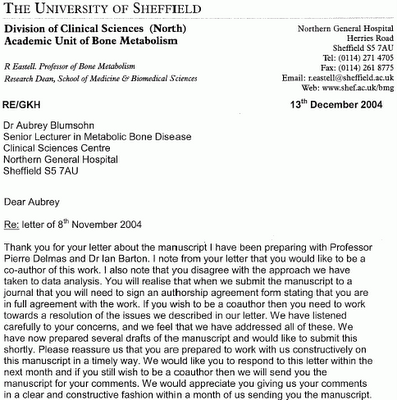
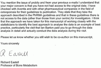
signed off on two further publications containing similar graphs and opaque statistical analysis ...... all while being
refused access to underlying data codes held by P&G.
The first step of any statistical analysis is to
PLOT THE DATA. Following
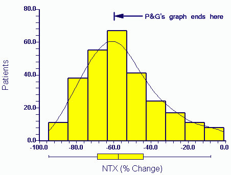
press exposure P&G eventually released the raw data to authors in April 2006. The distribution of the actual data for NTX change (the X axis variable) in the above paper (Eastell et al 2003) for patients taking Actonel is:

A third of the data would not have appeared within the range of the Procter and Gamble graph as plotted by them (P&G's graph ends at -60%).
Strange that.
The relevance of the missing end of the plot will be discussed in later postings. Suffice to say that these patients show responses more typical of the drug produced by P&G's competitor (Merck, Fosamax).
Earlier|
Later|
Main Page
 Procter & Gamble are proud winners of the 2006 "TRUSTe and Ponemon Institute" most trusted company for Privacy Award.

